
Every professional, particularly a freelancer, eventually confronts the need for a distinct identity. For nearly five years, one of my most personal projects was the "Ades Torres Photo" brand, a visual identity that represented my freelance work in photography and videography.
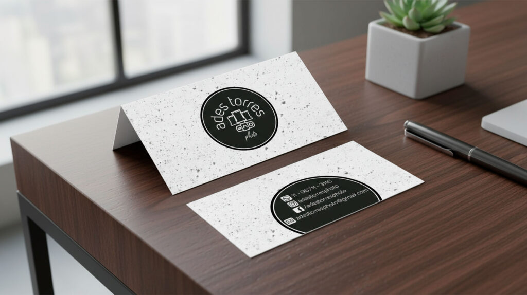
Its creation was born from a practical need: the time-honored business card. When attending events, people would ask for my contact, and I needed a professional mark to represent my work. The nomenclature was straightforward: "Ades," the nickname I've used in Brazil for over 20 years, combined with my surname, "Torres," and "Photo" to define the service.
The conceptual goal was to create a visual synthesis of my name and my craft. The challenge was to merge the concept of "Torres" (which means "Towers" in Portuguese) with a direct reference to photography.
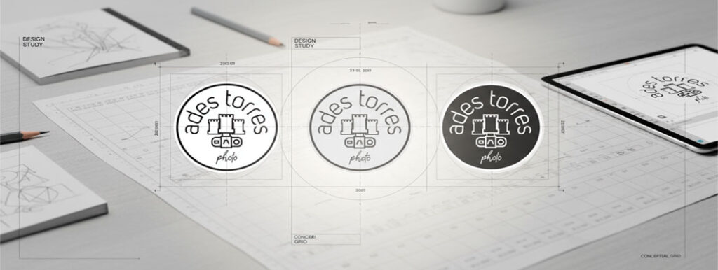
The solution was a logomark with a dual function.
At first glance, one sees a castle tower, a literal representation of "Torres." However, for the more detail-oriented observer, the icon reveals its second meaning: it is also a pictogram of a camera lens viewed from directly above. (Can you see it?)
This 'hidden' element was always my favorite part, but it often led to a question: "Why three towers, not just one? Wouldn't a single tower be easier to understand?"
It would have been, but this design was deeply personal.
For me, a tower symbolizes a structure of resilience, a foundation of support, a means to remain strong. I believe the secret to true strength isn't isolation; it's support. When I created this brand, I chose to embed a reference to my family—my core support system. At the time, we were three: my wife, my young daughter, and myself.
Thus, the three towers. They were not just an abstract symbol of strength; they were a concrete representation of my source of strength.
I no longer use this brand for my primary professional identity. Life has evolved; as I often joke, I would now need to add a fourth tower for my second daughter!
However, I look back on this mark with great fondness. It was more than a logo; it was a snapshot of a specific time in my life and career. It also served as the face of my YouTube channel for years, a story I will perhaps share in a future post.
It’s a small piece of my personal history, and I'm happy to share the story behind it. What did you think of the concept?